La música y el skate han sido el verdadero leitmotiv de la carrera artística de Sasha Barr. Empezó en la escena del street art, los posters para bandas locales de música y el grabado en la ciudad de Memphis, para terminar siendo uno de los directores de arte del reconocido sello de música independiente Sub Pop (conocido por ser el primero en contratar a Nirvana), en Seattle. Ha diseñado cubiertas de álbumes para bandas tan conocidas como Fleet Foxes, METZ, Flight of the Conchords o The Head and the Heart. Genuino y muy agradecido de su trayectoria, Sasha ha llegado a estar nominado a los Grammy por la dirección de arte de un álbum. En cuanto al skate, Barr ha trabajado para reconocidas marcas, pero su mayor hito es haber creado, junto a unos amigos, su propia marca de skate Amigos Skateboards.
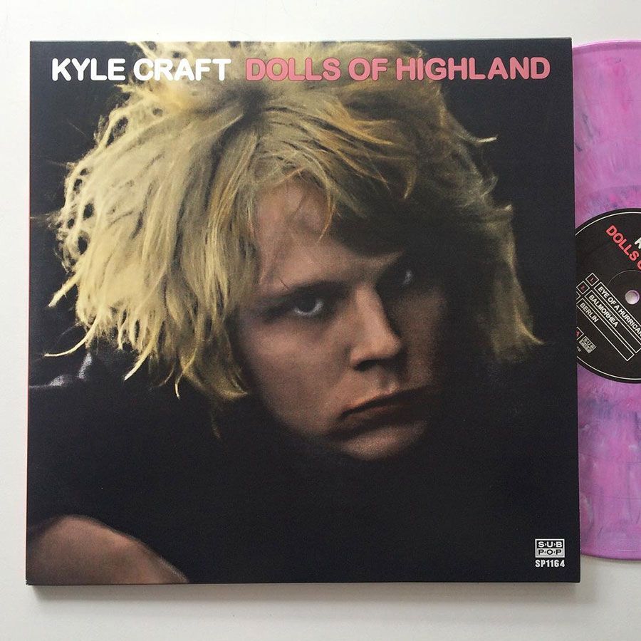
Sasha y su pared de ladrillos, un elemento que se repite en su portfolio, protagonizan la portada de Staf de este mes. Al artista le recuerda a un videojuego retro y a nosotros nos sorprende la fuerza de la ilustración. Además de esta pieza que el artista ha creado especialmente para Staf, os dejamos con esta interesante entrevista en la que el artista nos cuenta muchos detalles de su trayectoria.

Cuéntanos un poco tus antecedentes como artista…
Mis padres fueron estudiantes de arte y, a día de hoy, siguen siendo personas muy creativas; así que el arte y la creatividad han sido siempre gran parte de mi vida. Mi madre estudió grabado en la escuela y además sabe tejer, hacer punto y hacer tramas con tejidos. Mi padre es ceramista experto en serigrafía y además es profesor de animación digital en la universidad de Tennessee. Por mi parte, en la escuela secundaria, me dediqué mucho al dibujo, la pintura y el collage y, además, también aprendí la técnica de la serigrafía. Después de trasladarme de Middle Tennessee a Memphis en el año 2000 para ir a la universidad, empecé a interesarme por el street art; lo que me llevó a aprender los básicos del Photoshop para poder hacer flyers 11×17 y pegarlos por la ciudad. Navegaba mucho en internet y encontraba cosas que me inspiraban, de las que intentaba entender su proceso de creación. Tengo una licenciatura en grabado pero mi carrera se ha desarrollado más bien en el campo del diseño y de la ilustración, especialidades en las que he sido autodidacta. Desde entonces, mis trabajos han estado en constante evolución.

Tus inicios como artista están relacionados con los posters y el grabado. Esto me lleva a preguntarte lo siguiente: ¿Cuál es la historia detrás de “This is the New Year” y tus primeros pasos de tu carrera como artista?
Mi primer proyecto de diseño fue para una banda local de punk llamada Pezz en 2001: consistió sólo en algunas fotos para un estuche de CD muy simple. En esos entonces fue cuando descubrí la página web/comunidad Gigposters.com y empecé a probar con la serigrafía inmediatamente. Era amigo de la banda local Lucero y fueron ellos los que, muy amablemente, me ofrecieron que les hiciera un poster. Así fue cómo empecé a hacer posters para otras bandas locales y también para salas de conciertos, al mismo tiempo que, autodidactamente, aprendía Photoshop e Illustrator. De lo que más aprendí fue de Illustrator, ya que es el programa que realmente te permite trabajar la técnica de la serigrafía. Empecé a hacer más trabajos de packaging para bandas, más trabajos de pósters a nivel nacional y, finalmente, empecé a trabajar en el mundo del skate. Conocí a mis actuales compañeros en Sub Pop, Jeff Kleinsmith y Dusty Summers, en una de las primeras convenciones Flatstock en 2002. Ambos estaban también dentro de la escena de los posters en ese momento. En 2007, fruto de un capricho, me instalé en Seattle y tuve la suerte de que mi camino me llevara al departamento de arte de Sub Pop!
Respecto el título de mi página web “This is the New Year”, en ese momento, alrededor de 2004, estaba preparando mi nueva página de portfolio y necesitaba un nombre. Era el comienzo del año, así que “This is the New Year” fue, de hecho, una declaración objetiva. No fue hasta más tarde que me di cuenta de que una canción de Death Cab for Cutie se llamaba también así.

¿Cómo describirías el trabajo artístico que estas desarrollando?
Normalmente uso el término “ilustración gráfica”. Podríamos decir que Adobe Illustrator es mi herramienta principal, con un poco de Photoshop y algo de procesamiento a mano mezclado. He evolucionado mucho mi estilo alrededor de los gráficos vectoriales, así que, mientras creo ilustraciones nuevas, estas tienen su origen en un proceso más gráfico. Supongo que soy uno de esos tíos que está constantemente probando cosas nuevas. No quiero verme encasillado en un estilo particular aunque quiero que mi trabajo siga un hilo conductor. Últimamente, estoy disfrutando mucho trabajando con líneas gruesas y colores primarios, pero sigo trabajando con colores sólidos y texturas. Como mi estilo está tan arraigado en el grabado, me doy cuenta que muchas de mis ilustraciones acaban teniendo un toque algo parecido a la serigrafía o a la impresión tradicional. También tengo el título de director creativo o director de arte, así que mi paquete de habilidades se basa en el diseño en general, la maquetación y el formato, y la tipografía. Trato de poder aportar un poco de todos los aspectos.
¿Quién o qué es lo que más te ha influenciado?
Creo que diría que mis padres, como mínimo por su impulso creativo. En mi carrera profesional he aprendido un montón de mis compañeros de trabajo Jeff y Dusty. Como skater, no hace falta decir que los “grandes” de los 90’s y 00’s como Evan Hecox, Andy Jenkins, Andy Mueller, Sieben, Mcfetridge, Don Pendleton y muchos otros fueron influencias muy importantes en mi crecimiento personal. Actualmente, tengo la suerte de decir que estoy influenciado por mis amigos y compañeros como Nat Russell, Travis Millard, Mel Kadel, Jay Howell, Rich Jacobs, Russ Papa, Jay Croft, Stacey Rozich y otros. ¡A todos ellos les seguí durante años! Sin embargo, siempre estoy observando mí alrededor en búsqueda de cosas nuevas. Gracias a internet la corriente de cosas nuevas e interesantes no tiene fin. Además, la música es y será, por supuesto, una gran influencia, ¡pero esto sería una lista demasiado larga para la entrevista!

¿Cómo te involucraste con las marcas de skate? ¿Y con la industria de la música?
Respecto el skate, todo comenzó con mi amigo Joey Pulsifer. Tenía un viejo amigo de Tennessee que estaba trabajando en Giant Distribution a principios de los años 00’s, principalmente con la marca de ruedas Accel y con la marca de hardware Project Hardware. Joey era el tipo que estaba detrás de esta última marca y a través de mi amigo, me pidió que hiciera algunos gráficos para camisetas de su maraca. Joey también me lió con algunos diseños de tablas y de camisetas para la tienda de skate Furnace en Long Beach (California), además de otros trabajos con otras marcas más pequeñas.
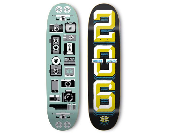
A medida que mi trabajo evolucionó, supongo que mi nombre salía más a menudo. Andy Jenkins me escribió en 2007, cuando estaba en Chocolate Skateboards, para hacer una tabla de skate para la marca, y esto fue increíble. Un par de años más tarde Joey me volvió a llamar y me puso en contacto con Chris Pastras, de Stereo; quien muy amablemente me dejó diseñar 8 (!) tablas de skate para ellos. Después de estas experiencias, hubo una especie de momento de calma para mí en cuanto al skate se refiere pero, por suerte, algunos amigos y yo decidimos empezar, en 2011, con el proyecto Amigos Skateboards. Amigos me abrió las puertas a la comunidad del skate de aquí, en el área de Seattle/Northwest. A través de Amigos también tuve la suerte de participar en varios proyectos con Vans y hacer amigos/conexiones en la industria del skate.
En cuanto a la música, como he comentado, empecé a nivel local en la escena musical de Tennessee, pero conocí a gente de todo el país y del mundo a través de eso, además de involucrarme en Gigposters.com y en las convenciones Flatstock Poster. Fue un proceso gradual de aproximadamente 7 años, desde el disco Pezz hasta conseguir trabajar en Sub Pop en Seattle. La música fue verdaderamente mi primer contacto con el trabajo profesional y autónomo. Fue el trabajo en la industria de la música lo que me llevó a todo lo demás. Mis primeros trabajos centrados en carteles y carátulas de álbumes me llevaron, más tarde, a trabajar en el mundo del skate y de la ilustración.

Has sido director de arte en el sello Sub Pop de Seattle desde 2007. ¿Cuál es el proceso creativo que sigues para la creación de una portada de un álbum de música?
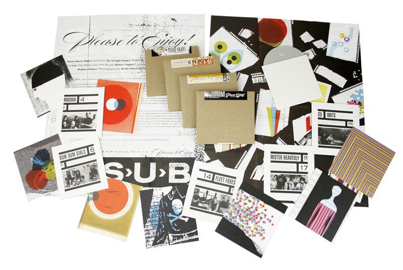
Nuestro papel principal en el desarrollo de álbumes de música es ayudar a las bandas a plasmar la realidad de su visión de la música que hacen. Pronto aprendí que las bandas no estaban necesariamente buscando mis habilidades personales de ilustración o arte, sino mis habilidades como director de arte para ayudarles a hacer realidad su sueño. A veces esto implica trabajar con creatividades que las mismas bandas entregan (pinturas, dibujos, fotos, etc.). Y aquí es donde empieza mi trabajo: averiguar cómo hacer que estas piezas encajen. A veces las bandas se presentan con una idea general o ejemplos de cosas que les gustan y es mi trabajo encontrar a los artistas o fotógrafos que mejor podrán desarrollar esa idea. Disfruto mucho de esa parte del proceso: tener manga ancha para contratar a artistas cuya obra me encanta. Por otro lado, invierto gran parte del tiempo simplemente creando los textos o los logotipos para los álbumes, por no hablar de los folletos, encartes y todo lo que va dentro de un álbum. Dependiendo del presupuesto de producción, también es mi responsabilidad encontrar maneras interesantes y creativas de “envolver” el álbum: desde implementar troquelados, relieves, láminas o cualquier otro recurso.
Honestamente, el trabajo que hago en los álbumes de música suele mostrar muy poco de mi propio estilo de arte e ilustración; ¡lo que es totalmente perfecto! Me encanta el papel de un director de arte o director creativo. Ayudar a una banda a hacer realidad su idea es muy satisfactorio. Oriento mi trabajo en el sentido de la resolución de problemas más que de tratar de encajar mi propio arte en algo donde simplemente no encaja. Afortunadamente, tengo toda la libertad del mundo para desarrollar mi creatividad en Sub Pop, así que no sólo estoy limitado a la creación de los álbumes.
Tengo la suerte de poder trabajar en los productos que tenemos en nuestra tienda online y en la tienda de SeaTeac Airport. Esto incluye desde el desarrollo de productos hasta la creación de los gráficos o el embalaje de los mismos productos o el diseño de la tienda. Desde el punto de vista de la ilustración, tengo mucha libertad creativa a la hora de desarrollar la imagen de nuestras listas de reproducción de Spotify y de streaming, así como también para crear la imagen gráfica de nuestras plataformas de redes sociales. En Sub Pop nos gusta decir que somos los responsables de todo lo que tiene que ver con la representación visual de la marca.

En Sub Pop Records, has trabajado como director de arte para numerosos álbumes de bandas conocidas. ¿Cuál sería el álbum del que estás más orgulloso y por qué?
Probablemente debería decir el álbum de Father John Misty por varias razones: por el asombroso packaging que creamos, las increíbles ilustraciones de Stacey y, sobre todo, la nominación al Grammy que recibimos. Fue sin duda un gran proyecto. Tuve la suerte de poder trabajar con Father John Misty y Stacey.
Exactamente, fuiste nominado a los premios Grammy por tu dirección de arte de la edición Deluxe del álbum de Father John Misty (2005) titulado “I Love You, Honeybear”. Cuéntanos un poco sobre este proyecto y como fue el hecho de estar nominado a los premios más importantes de la industria de la música.
Josh (Father John Misty) tiene un poder creativo brutal, así que todo el proyecto fue un reflejo de su visión. Él contactó con Stacey Rozich para las ilustraciones. Yo había sido un fan de las ilustraciones a acuarela de Stacey, así que estaba emocionado de poder trabajar con ella en el proyecto. Josh tenía en mente un packaging para el LP que tuviera elementos “pop-up” cuando se abriese y un reproductor MIDI incorporado que reproduciría una canción cuando se abriera la tapa; así que trabajé con el proveedor Stoughton para encontrar la manera de desarrollar una pieza que funcionara. Fue, sin duda, un reto, ya que no habíamos visto algo similar antes. Finalmente, la construcción final se parecía más a un diorama 3D que a un desplegable tradicional. Por desgracia, una vez el producto final cogió forma, vimos que el diseño no acababa de funcionar. Después de un comunicado de prensa y la reconfiguración del diseño, fuimos capaces de solucionar el problema lo mejor que pudimos. ¡A veces tienes que romper algunos huevos para hacer una tortilla!
El reconocimiento en los Grammy fue, ciertamente, una experiencia. No hace falta decir que el proyecto fue un esfuerzo de grupo entre Josh, Stacey, Stoughton Printing, mis compañeros de trabajo en Sub Pop y yo mismo. Los premios Grammy de packaging los reciben los directores de arte, así que, en este caso, el premio iba para Josh y un servidor. Sin duda alguna, la nominación fue un honor. En última instancia, no recibimos el premio (el álbum que ganó, uno de Third Man, era exageradamente increíble), ¡pero estaba muy agradecido por la experiencia!
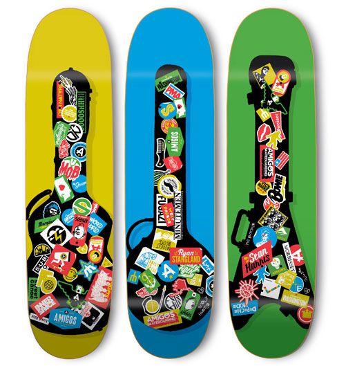
Desde el año 2011 eres copropietario y director de arte en Amigos Skateboard, en la que diseñas todo lo que rodea la marca, desde ilustraciones para productos hasta material promocional. Después de haber trabajado para algunas de las marcas de skate y urbanas más importantes, ¿cómo es crear los diseños para tu propia marca?
Es genial. Sin lugar a dudas ha sido una experiencia fantástica. Los chicos con los que llevo Amigos dejan, prácticamente, todo el control creativo en mis manos, ¡así que puedo probar lo que quiero con nuestras tablas y productos! ¡Qué más puedo pedir! Ser parte de Amigos me ha permitido ser una parte importante de la comunidad de skate local gracias a la posibilidad de participar en el desarrollo de tablas y camisetas para tiendas de skate, así como ayudar con eventos y exposiciones de arte. La escena del skate de Seattle/Pacífic Northwest es tan fuerte y llena de tal diversidad de personas que me siento muy afortunado de formar parte de ella.
¿Cuál ha sido el encargo (briefing) más complicado que nunca hayas recibido por parte de una marca y cuál fue el resultado final?
¡Esta es una pregunta difícil! La única cosa que me viene en mente es el proyecto Signal Box. Fue verdaderamente complejo. El proyecto consistía en crear los gráficos de trece cajas de material eléctrico de calle de un barrio en Seattle. Cada caja tiene 5 caras únicas y cada caja estaba inspirada en un negocio o tienda particular del barrio.

¿Cuál fue el proceso creativo que había detrás de este proyecto?
Colaboré con mi amigo y diseñador Mateo Hollister en el proyecto y nos sentamos con cada una de las tiendas para hablar con ellas sobre su negocio y su papel en el vecindario. Queríamos que todas las cajas tuvieran alguna similitud visual pero que cada una tuviera también su propia identidad. Las piezas finales se imprimieron en vinilos de colores que se aplicaron a las cajas. El proyecto fue encabezado por un grupo de Seattle llamado Urban Artworks, una organización sin ánimo de lucro dedicada a la creación de murales y arte público en la ciudad. Ellos han estado liderando el proyecto de las cajas eléctricas desde hace un tiempo y, hasta entonces, todas eran pintadas a mano, hasta que nosotros participamos en el proyecto en South Lake Union y decidimos apostar por el vinilo para probar algo diferente. Esto nos proporcionó un poco más de espacio para jugar con los colores y los gráficos.
¿Hasta qué punto disfrutas más creando una pieza de arte urbana respecto a una creación artística de estudio?
Creo que el arte urbano es algo que siempre ha formado parte de mí. Creo que lo que me llevó a dedicarme al diseño fueron esos años de universidad en los que me dedicaba a pegar flyers por las calles de Memphis. Me encantó el proyecto de las cajas de material eléctrico y estoy muy contento de estar trabajando con Urban Artworks en algunos murales. Algunos de los trabajos que he hecho con Vans, hasta ahora, han sido en el ámbito público, así como un par de pequeños murales para Amigos. ¡Siempre es divertido ver tus obras por el mundo!

¿Por qué ojos y manos son tan importantes en tu obra?
Oh, me gustaría tener una buena respuesta para esta pregunta. ¿Quizás porque me gustan sus formas? Los ojos son siempre un punto focal divertido en las obras ya que siempre te devuelven la mirada.
¿En qué estás trabajando actualmente?
Vamos a ver… Actualmente estoy preparando una pequeña exposición de arte colectiva para presentar la línea de ropa que vamos a lanzar conjuntamente los de Sub Pop y los de Altamont Apparel. Esto será a finales de julio y ¡será una exposición muy divertida! Trabajar con la gente de Altamont en la línea de ropa fue una gran experiencia y, en mi opinión, creo que la colección final es genial. Vamos a hacer el evento en una de las tiendas de skate más importantes de Seattle, en 35º North. Por lo que se refiere a Sub Pop tengo un par de proyectos secretos que (esperemos) podré presentar de cara al año que viene. Nuestro 30 aniversario será en el año 2018, así que estamos tratando de planificar este evento también. Además, estoy ocupado pensando en qué hacer para el Vans US Open Bowl del próximo mes en Huntington Beach. Fue una experiencia realmente fantástica el año pasado y ¡tengo la suerte de poder trabajar en este evento otra vez! También estoy trabajando en la cubierta para Staf magazine y mas cosas interesantes.


English:
SASHA BARR. GRAPHIC ILLUSTRATION MADE IN SEATTLE
Music and skate have been, indeed, the truly leitmotiv of Sasha Barr’s artistic career. He started in the street art scene as well as doing posters for local music bands and doing printmaking in Memphis; and ended up being one of the art directors of the well-known record label Sub Pop (known for being the first to get on board Nirvana), in Seattle. He has design the album covers for such famous bands as Fleet Foxes, METZ, Flight of the Conchords or The Head and the Heart. Genuine and very thankful to his career path, Sasha has even gotten to be nominated to the Grammy awards for the art direction of an album cover. When it comes to skate, Barr has worked for premium brands, but his main milestone has been to have created, together with some friends, his own skate brand Amigos Skateboards.
Sasha and its brick wall, an element that repeats in its portfolio, are the protagonists of Staf’s cover of this month. It reminds a retro videogame to the artist and it surprises us for the strength of the illustration. Besides this art piece that the artist has specially created for Staf, we offer you an interesting interview in which the artist tell us many details of his career path.
What is your background as an artist?
My parents were both art students in school and still are creative people, so art and creativity have always been a big part of my life. My mother was a printmaking student in school, who now spins, knits and weaves fabrics; and my father is a screen-printing ceramicist who also teaches digital animation at a university in Tennessee. I did a fair amount of drawing, painting, and collage in high school, and learned how to screen-print as a teenager. After moving from Middle Tennessee to Memphis, TN in 2000 for college, I started getting in to street art stuff, teaching myself Photoshop basics to make 11×17 flyers to paste up around the city. I surfed around on the internet and just found stuff that inspired me, essentially trying to figure out the processes. I have a Bachelor’s degree in Printmaking, but my career has been made as a designer/illustrator, which I guess was all mostly self-taught. It’s been constantly evolving ever since.
Your beginnings as an artist are related to poster making and screen-printing. What is the story behind “This is the New Year” and your first career steps as an artist?
My first design project was for a local punk band called Pezz in 2001: just some photos in a basic CD jewel case. Somewhere in there, I found the website/community Gigposters.com and instantly wanted to try to screen-print posters. I was friends with the guys in this local band Lucero, who were kind enough to let me do a poster for them. From there I started doing posters for other local bands and venues, teaching myself Photoshop and Illustrator along the way. I was mostly teaching myself Illustrator because it really lent itself well to the screen-printing process. I started doing more packaging work for bands, more poster work on a national level and eventually some stuff in skating. I’d first met my coworkers in the Sub Pop art department Jeff Kleinsmith & Dusty Summers at one of the first Flatstock conventions in 2002, who were also in the poster scene at the time. In 2007 I moved out to Seattle on a whim and just lucked my way into the Sub Pop art department!
With the “This is the New Year” website title, at the time (I think around 2004); I was putting together a new portfolio site and just needed a name. It was actually the beginning of that calendar year, so “This is the New Year” was more of a factual statement. It wasn’t till later I realized it was also a Death Cab for Cutie song.
How would you describe the artwork that you are currently creating?
I typically use the term “graphic illustration.” I would say Adobe Illustrator is my main tool, with a little Photoshop and hand rendering mixed in. I’ve really evolved my style/process around vector graphics, so while I’m creating new and unique illustrations, at their core they’re rooted in a more graphic process. I guess I’m also one of those guys who are continually trying out new things. I don’t really want to find myself pigeonholed in to one particular look or style, though I want there to be some common thread in my work. Lately I’ve been really enjoying working with thick lines and primary colors, though I do still work in just solid colors and textures. Since my style is so rooted in printmaking I find myself giving a lot of my illustrations a “screen-print” sort of feel or traditional print vibe. I also hold the title of “art/creative director,” so I have a skill set that’s rooted in just general design, layout and typography. I try to be well rounded.
Who or what has influenced you the most?
At my roots, I’d say my parents. At the very least maybe just their creative drive. In my professional career I’ve definitely learned a ton from my coworkers Jeff and Dusty. As a skater it goes without saying that the “greats” of the 90s/00s like Evan Hecox, Andy Jenkins, Andy Mueller, Sieben, Mcfetridge, Don Pendleton and so on were all huge influences on me growing up. These days I’m lucky enough to say I’m influenced by my friends/peers like Nat Russell, Travis Millard, Mel Kadel, Jay Howell, Rich Jacobs, Russ Pope, Jay Croft, Stacey Rozich and others; all of whom I looked up to for years! I’m kind of always looking around for new stuff, though. Thanks to the internet there’s a never ending stream of new, cool stuff. Music is of course a huge lifelong influence, but that’d be a long list!
How did you get involved with skate brands? And with the music industry?
With skating it all really started with my friend Joey Pulsifer. I had an old friend from Tennessee that was working at Giant Distribution in the early 00s, namely with the wheel brand Accel and hardware brand Project Hardware. Joey was the main dude behind Project, and through my friend he asked me to do some t-shirt graphics for them. Joey also hooked me up with some board and t-shirt graphics for Furnace skate shop in Long Beach, CA and some work with other smaller brands.
As my own work evolved and changed over the years, I guess I was getting my name out there a bit more. Andy Jenkins over at Chocolate Skateboard wrote me in 2007 to do a board for Chocolate, which was amazing. A couple years later Joey came back around and got me in touch with Chris Pastras over at Stereo, who was kind enough to let me do 8 (!) boards for them. There was kind of a lull for me in skate stuff for a while after that, but thankfully some friends and I decided to start Amigos Skateboards in 2011. Amigos opened me up to the greater skate community here in the Seattle/Northwest area. Through Amigos I was also lucky enough to get involved with projects with Vans and make friends/connections throughout the skate industry.
With music it’s a lot of what I mentioned earlier- I started on a hyper local level in the Tennessee music scene, met people from around the country/world through that, Gigposters.com, and the Flatstock Poster conventions. It was a gradual process of about 7 years from the Pezz album to getting the gig at Sub Pop in Seattle. Music was really my first introduction to professional and freelance work; it was my work in the music industry that leaded to everything else. Working in the skate world, illustration world, and anything else freelance related all stemmed from the work I was doing in posters and album art.
You have been art director at the Seattle based record label Sub Pop since 2007. What is the creative process you follow for generating the album cover for a music band?
Our main role in regards to album art projects is to help the bands see their vision come to life. I learned early on that bands weren’t necessarily looking to me for my own personal illustration or art skills, but for my abilities as an art director and to help facilitate their dream in whatever way possible. Sometimes this involves working with art the bands submit, which could be anything under the sun- paintings, drawings, photos, etc. – and it’s my job to figure out how to best make it work. Sometimes bands come to me with just a general idea or examples of things they really like, and it’s my job to find artists or photographers that can best bring that idea to life. I’ve grown to really enjoy that part of the process, being able to hire artists whose work I love is a great feeling. I also spend a fair amount of time just making text or logos for each album, not to mention liner notes, booklets, inserts and anything else that goes in an album package. Depending on the production budget, it’s also my responsibility to find interesting ways to package the album, which can be die cuts, embossing, foils or whatever else goes with the art and overall vision.
To be honest, the work I do on albums typically shows very little of my own illustration or art style, which is totally cool! I love the role of an art/creative director. It’s a great feeling to help a band make their idea a reality. I think of it more like problem solving or a different kind of creativity than trying to force my own art in to something where it doesn’t belong. Thankfully my creative opportunities at Sub Pop aren’t limited to just the albums.
I’m lucky enough to be able work on products like we have in our online store and SeaTeac Airport store, which includes everything from product development to the graphics that goes on the products and packaging themselves, not to mention being able to help design the store itself. From an illustration standpoint, I get a lot of creative freedom with our Spotify and streaming playlists, as well as graphics for our social media platforms. As we like to say, we’re responsible for anything that’s a visual representation of the label.
You have work in many album projects of very well-known bands as an art director at Sub Pop Records. Which one would be the one you are most proud about it and why?
I should probably say the Father John Misty release because of the crazy packaging, Stacey’s incredible illustrations and over all Grammy nod. That was definitely a great project. I was lucky to be able to work with Father John Misty and Stacey with bringing it to life.
Exactly, you were nominated at the Grammy’s awards for your art direction of the Deluxe Edition of Father John Misty’s 2015 album “I Love You, Honeybear”. Tell us a little bit of this project and how was to be nominated by the major music industry awards.
Josh (Father John Misty) is a creative super power for sure, the whole project was his very well thought out vision. He reached out to Stacey Rozich for the illustrations; I’d been a fan of Stacey’s water color illustrations for a while, so I was psyched to be able to work with her on the project. Josh had this vision for a gatefold LP jacket that had “pop-up” elements when opened and an embedded MiDi player that would play a song when the jacket was opened, so I worked with our jacket manufacturer Stoughton on figuring out how to make something that worked. It was definitely a challenge, as we hadn’t seen anything like it before. We eventually landed on the final construction, which was more of a 3D diorama than a traditional pop-up. Unfortunately, once the final product started making its way in to the world, we found that the design did not work out. After a press release, a recall and some reconfiguring, we were able to fix the problem as best we could. Sometimes you got to break some eggs to make an omelet!
The Grammy nod was an experience for sure. It goes without saying that the project was a group effort between Josh, I, Stacey, Stoughton Printing and my co-workers at Sub Pop. The Grammy awards for packaging go to the credited art directors, so in this case it went to Josh and me. Without a doubt the nomination was an honor. Ultimately I didn’t get the award (the package that won, a Third Man release, was an insanely incredible package), but I was very thankful for the experience!
Since 2011, you are co-owner and art director at Amigos Skateboards, where you are designing everything for the brand from product graphics to promotional material. After having worked for some of the top skate and urban brands, how is it to create the designs for your own brand?
It’s great. Without a doubt it’s been a fantastic experience. The guys I run Amigos with are kind enough to pretty much give me creative control, so I’m able to try things out with our boards and products as I want! Doesn’t get much better than that, ha! Doing Amigos has also led me into playing a larger part in the local skate community, through helping shops out with boards and tees as well as helping out with events and art shows. The Seattle/Pacific Northwest skate scene is so strong and full of a great diverse group of people, I’m really fortunate to be able to be a part of it.
What is the most complicated briefing you have received from a brand and how was the resulting art piece being?
That’s a tough one! The one thing that comes to mind is the Signal Box project. It was definitely complex. The project was to come up with graphics for 13 signal boxes in one neighborhood in Seattle (each box having 5 unique sides), with each box being inspired by or relating to a particular business in the neighborhood.
What was the creative process behind this project?
I collaborated with my friend and designer Matthew Hollister on the project and we sat down with each of the businesses to talk with them about their business and their role in the neighborhood. We wanted all of the boxes to have some visual similarity but for each have its own unique look and vibe. The final pieces being printed as full color vinyl wraps that were applied to the boxes. The overall project was spearheaded by a group here in Seattle called Urban Artworks which is a non-profit dedicated to creating murals and public art in Seattle. They’ve been doing the signal boxes for a while, all of which were hand painted until this project in South Lake Union. We went with the vinyl wraps to try something different, in the end it gave us a bit more room to play with colors and graphics.
How much do you enjoy creating a street piece in comparison with a studio created art piece?
I think the street art stuff is something that’s always been with me. I attribute wheat pasting flyers around Memphis in my early college days as what originally got me in to design. I loved working on the signal boxes and am super stoked to be working with Urban Artworks on some murals. Some of the stuff I’ve done with Vans so far has been in the public realm, as well as a couple small murals for Amigos. It’s always fun to see your stuff out in the world!
Why eyes and hands are so important in your art work?
Oh, I wish I had a good answer for this! I think I just like the shapes? Eyes are always a fun focal point in pieces, too. It’s looking back at you!
What are you currently working on?
Let’s see… At the moment I’m putting together a little group art show for the end of July that consists of Sub Pop and Altamont Apparel employees to celebrate the release of the collaborative clothing line we’ve been working on. That’ll be a fun one! Working with the folks at Altamont on the clothing line was a great experience, super people over there and I think the lined turned out great! We’ll be doing the event at one of the premier Seattle skate shops, 35th North. Sub Pop wise I have a couple secret projects that’ll (hopefully) be revealed in the next year or so….Our 30th anniversary is in 2018 so we’re trying to think ahead a bit on that. I’m starting to try and figure out what I’ll do in the Vans US Open bowl next month in Huntington Beach. That was a really fantastic experience last year and I’m lucky enough to be able to work on it again! I’m also working on the cover for this Staf issue!
www.thisisthenewyear.com
www.subpop.com