(english below) Julian Montague es un artista, ilustrador, diseñador gráfico y fotógrafo radicado en Buffalo, Nueva York. Su obra abarca una amplia gama de medios y enfoques, desde proyectos conceptuales basados en fotografías a largo plazo hasta la creación de elementos efímeros para una institución de arte ficticia de la década de 1970, pasando por abstracciones geométricas hechas con telas de ropa vieja. Montague ha expuesto ampliamente y tiene obras en numerosas colecciones públicas y privadas. En 2023, se llevó a cabo una exposición retrospectiva de mitad de carrera de su obra en el Burchfield Penney Art Center en Buffalo, Nueva York.
Su trabajo ha recibido atención de Dwell, Frieze, Hyperallergic, It’s Nice That y muchos otros medios. En 2021, The New York Times recomendó su cuenta de Instagram como una de las mejores cuentas de arte para seguir.
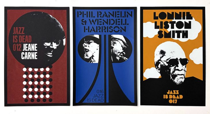
Como artista/diseñador, Montague ha colaborado con clientes globales, incluidos Continental Tires, Maison Kitsuné, Monotype, Moncler, Sonos y Warby Parker. Montague trabaja a menudo en las industrias editorial y musical, destacando su colaboración con el sello discográfico Jazz is Dead, de Adrian Younge y Ali Shaheed Muhammad, para el cual diseñó la identidad visual del sello y el empaque de más de 25 álbumes. El año pasado, la Universidad de Chicago Press publicó una edición revisada de su libro de 2006 The Stray Shopping Carts of Eastern North America: A Guide to Field Identification. El libro fue el resultado de un proyecto artístico a largo plazo que creó un elaborado sistema de clasificación para carros de compra desviados de su uso previsto.
¿Por qué te hablamos de Julian? Porque estos días aterriza en España en el festival Moments, y queremos que descubras a uno de los grandes creativos del siglo XXI. No dejes de visitarlo si estás por Madrid, Sevilla o Málaga en los próximos días.
¿Cómo influyó tu ciudad natal, Buffalo, en el desarrollo de tu enfoque artístico y visual?
Creo que crecer en una ciudad en declive me dio una perspectiva particular. Para quienes no lo saben, Buffalo está en el extremo oeste del estado de Nueva York, en el lago Erie, a solo 30 km de las Cataratas del Niágara. Está tan lejos de Nueva York como Barcelona de Madrid. En los años 90 y principios de los 2000, las condiciones en Buffalo eran similares a otras ciudades del “rust belt” como Detroit y Cleveland. Décadas de declive económico y demográfico dejaron a estas ciudades victorianas, antes ricas, con la sensación de estar en ruinas vacías. En ese momento, muchos artistas locales se interesaron por explorar la realidad de la ciudad, y mi proyecto sobre carritos de supermercado abandonados fue mi manera de comprometerme con esa idea. Una influencia clave vino de un fanzine experimental llamado “Basta!”, cuyo tema principal era qué significaba vivir en una ciudad del rust belt en descomposición y qué posibilidades ofrecían esas condiciones. Proponía la idea de que en Buffalo ya no teníamos nada que perder, y que podíamos hacer que las cosas sucedieran por nosotros mismos. Esa sensación de desafío fue importante en un momento en que se consideraba que las ciudades más pequeñas eran lugares culturales rezagados y se esperaba que la mayoría del talento y la energía fueran absorbidos por Nueva York. La idea de que podía hacer algo a partir de la situación de nuestra ciudad en nuestros propios términos fue importante para mí. Hoy en día el ambiente es más positivo, pero muchos de los problemas subyacentes aún existen.
¿Cuál fue la motivación detrás de tu proyecto “The Stray Shopping Carts of Eastern North America”? ¿Qué te inspiró a crear un sistema de clasificación para carritos de compra abandonados?
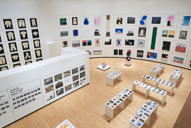
La idea del proyecto surgió en 1999, en Buffalo. Estaba conduciendo por una intersección en una zona comercial de la ciudad y, por alguna razón, me di cuenta de que había carritos de compra en cada esquina, en paradas de autobús, aparcamientos, jardines, algunos volcados, y en ese momento me pareció algo extraño. Me di cuenta rápidamente de que si solo tomaba fotos de los carritos por la ciudad, se percibiría como una fotografía documental social convencional. Aunque no estaba en desacuerdo con las implicaciones sociales y políticas de ese tipo de trabajo, pensé que sería más interesante ver a los carritos como objetos que se mueven por el espacio urbano de una manera única. A diferencia de otras formas de basura, los carritos pueden ser apropiados y re-apropiados, moviéndose de un lugar a otro durante años. Pueden ser utilizados para fines utilitarios o para actos más metafísicos como el vandalismo o bromas visuales. Esto me llevó a ver los carritos como un fenómeno natural, casi animal, que podía estudiar a través de la observación. Decidí categorizarlos según las situaciones en las que los encontraba y el potencial que tenían para pasar a otras situaciones. Esto finalmente llevó a un sistema de dos clases principales: “True Strays” y “False Strays”, con 33 subcategorías. El proyecto, en el que trabajé desde 1999 hasta 2007, trata sobre cómo el lenguaje y el nombramiento pueden cambiar la forma en que la gente ve las cosas. El proyecto le da lenguaje a algo familiar que no se había articulado. Después de ver el trabajo, la gente me dice a menudo que ve carritos por todas partes o que se encontraron con uno y se preguntaron a qué categoría pertenecía. Incluso si pensaban que el proyecto era ridículo, saber que alguien había nombrado los diferentes tipos de situaciones con carritos era algo difícil de olvidar una vez conocido.
¿Cómo equilibras tu trabajo entre el diseño gráfico comercial y tu arte conceptual más personal?
Es difícil equilibrar el tiempo. Especialmente ahora que tengo hijos pequeños, es mucho más complicado encontrar tiempo para el lado experimental de la práctica artística. En cuanto al equilibrio conceptual, creo que están cada vez más cercanos. Aunque mantengo una distinción entre ambas prácticas, cada vez hay más superposición entre los elementos visuales de mi trabajo artístico y de diseño. Cuando los clientes me muestran el trabajo que les gusta, a menudo es una mezcla entre trabajo para clientes y mi obra artística.
¿Qué procesos creativos sigues cuando diseñas identidades visuales para marcas y sellos discográficos como “Jazz is Dead”? ¿Cómo llegaste a trabajar con este sello de jazz tan genial?
Para mí, el diseño de identidad es un proceso de prueba y error. Hago muchos bocetos para encontrar direcciones viables, y luego hay un intercambio continuo con el cliente para llegar a la solución adecuada. La identidad de “Jazz is Dead” implicó mucho diálogo con Adrian Young, quien cofundó el sello junto con Ali Shaheed Muhammad (A Tribe Called Quest). Trabajar con otros artistas añade una capa adicional de diálogo, ya que tienen una idea muy matizada de cómo quieren que se sienta su proyecto. Adrian me contactó por Instagram, dijo que le gustaba mi trabajo, y le dije que me avisara si quería colaborar. Poco después comencé a trabajar en “Jazz is Dead”. Creo que me eligió porque ambos compartimos un interés en abordar el pasado (particularmente los años 70) de una manera similar.
¿Qué te llevó a crear la institución de arte ficticia de los años 70 como parte de tu obra conceptual?
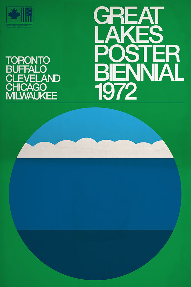
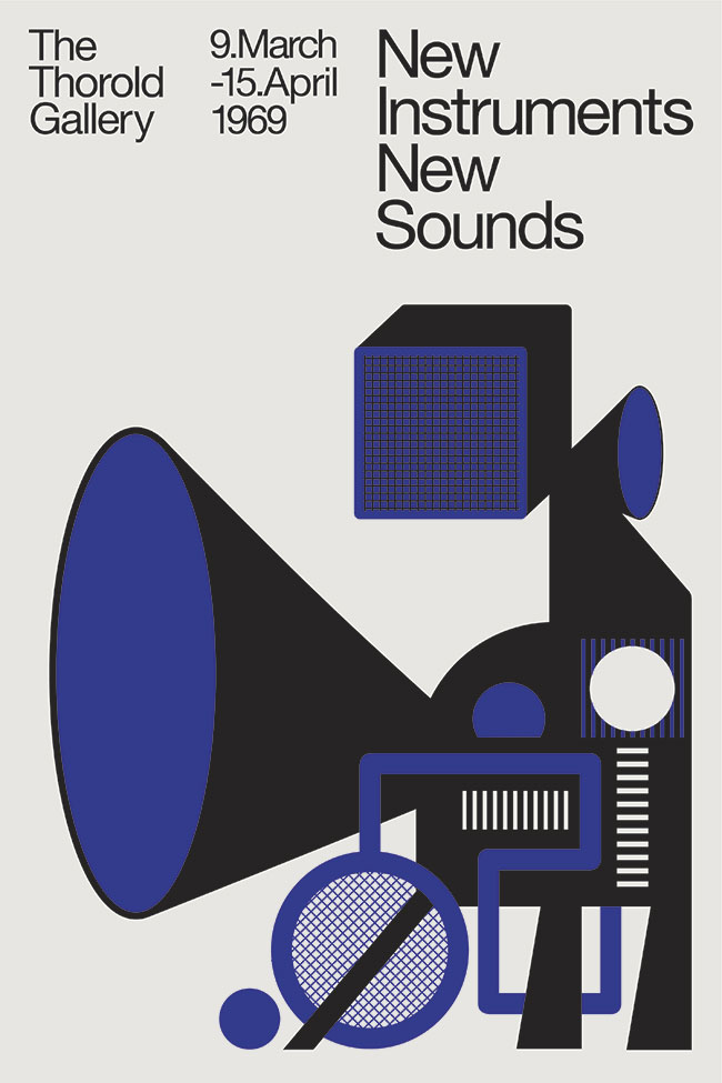
Empecé a crear libros falsos en 2010 como parte de un proyecto artístico multifacético sobre la intersección entre animales y arquitectura, especialmente respecto a arañas e insectos. Parte del marco del proyecto era que había un autor desconocido en el centro. Me di cuenta de que podía incluir el “material de lectura” de este autor ficticio en las exposiciones, en forma de libros antiguos con cubiertas que creaba yo mismo. Los libros trataban sobre animales y arquitectura y parecían ser de mediados del siglo XX. Esto me permitió insertar ideas directamente en la mente del espectador de una manera autoritaria. Algunas personas pensaban que los libros eran reales, pero incluso si sabías que eran falsos, te veías obligado a imaginar de qué trataba el libro. Realicé discos ficticios, cubiertas de libros y pósters para este proyecto durante varios años, lo que incluyó carteles para una galería de arte ficticia llamada “Thorold Gallery”. En algún momento, la galería cobró vida propia y empecé a crear solo material para “Thorold”. Me gustó la idea de que el cartel de una exposición fuese un estímulo para que el espectador imaginara la exposición en sí.
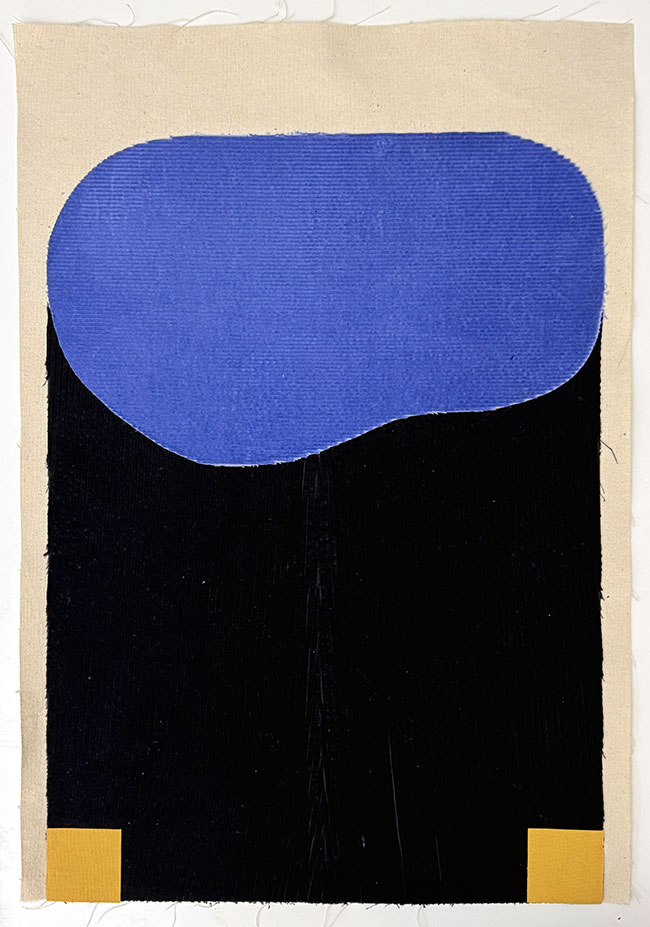
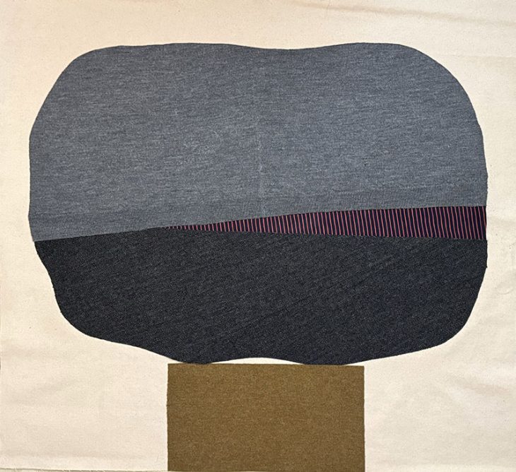
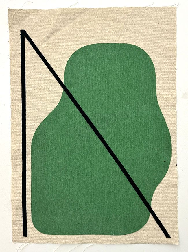
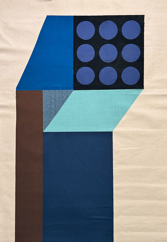
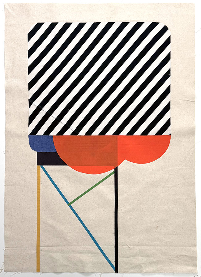
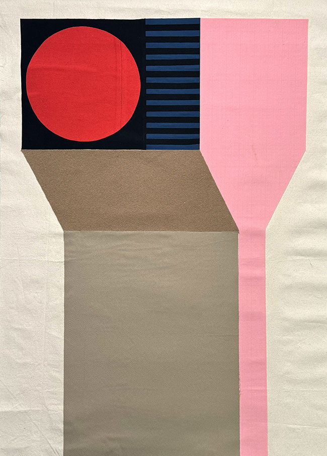
En tu proyecto “Domestic Materials,” ¿cómo utilizas materiales domésticos para crear abstracciones geométricas y qué mensaje intentas transmitir con este trabajo? Cuéntanos sobre este nuevo proyecto, que, si no me equivoco, visita Europa por primera vez.
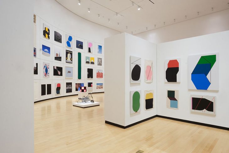
No he mostrado este trabajo en Europa antes. El lenguaje visual de estas piezas se desarrolló en los últimos años a través de mis pinturas. Curiosamente, originalmente comencé a hacer pinturas solo porque estaba creando material para los artistas que inventé para mis carteles de exposiciones ficticias. Así que, de manera irónica, caí en una práctica artística formalista. Había trabajado con telas usadas en proyectos anteriores, sobre todo para hacer piezas grandes al menor costo posible. Con estas piezas hay algo de esa sensación; disfruto tomar estos materiales mundanos, a menudo mi ropa vieja, y darles un nuevo propósito no utilitario. No es un trabajo orientado a un mensaje en el sentido de que no pretendo que la elección de materiales haga una declaración sobre la moda rápida o el consumismo excesivo, al menos no directamente. En cuanto a la experiencia del arte, me interesa más cómo estas texturas familiares afectan el tono de las piezas. La mayoría de las composiciones son abstractas, pero tienden a parecerse a estructuras de algún tipo. Me he dado cuenta recientemente de que creo que estoy haciendo referencia subconscientemente a todas las extrañas torres industriales y edificios abandonados en Buffalo. También hay algunas piezas representativas mezcladas; estoy tratando de entender cómo su presencia cambia las demás piezas.
Cuéntanos sobre el taller que vas a realizar en Sevilla, Málaga y Madrid.
El taller, “Designing in Reverse,” es un conjunto de ejercicios y experimentos inspirados en la forma en que hago mis carteles ficticios y portadas de libros. A diferencia del diseño basado en clientes, donde recibes la información del título y luego formulas un concepto y diseño para la portada, con mis ficciones a menudo tengo una gráfica en mente y luego trato de pensar en un título que le encaje. Encuentro que este proceso de pensamiento creativo es una excelente manera de desarrollar una práctica generativa de bocetos.
¿Qué es lo que más te gusta de España y también del diseño en España?
Me encanta España. Mi historia personal con el país se remonta a mucho tiempo atrás. Mi madre era profesora de español en secundaria y organizaba muchos intercambios estudiantiles, aunque no fui a la escuela donde ella trabajaba, pudo organizarlo para que yo fuera a España como estudiante de intercambio. Pasé seis semanas con una familia en Asturias en el verano de 1990, cuando tenía 16 años, y luego cinco meses con otra familia en Jávea y Madrid en el verano/otoño de 1991. Sé un número sorprendentemente alto de canciones de Mecano y Duncan Dhu. De alguna manera no volví a España hasta 2013, pero esta será mi cuarta visita en 10 años. He estado trabajando en revivir el español intermedio que aún tengo en la cabeza.
Mi impresión es que España es un gran lugar para el diseño gráfico. Sigo a varios diseñadores y estudios ibéricos en Instagram, algunos de los cuales he conocido en persona también. Algunos que me vienen a la mente son Hey Studio, pfp, disseny, Estudio Husmee, TGA, Studio Quim Marin, Unbuentipo y otros que probablemente olvido.

Tu cuenta de Instagram ha sido destacada como una de las mejores cuentas de arte por “The New York Times”. ¿Cómo gestionas el contenido digital y las redes sociales para promocionar tu trabajo?
Mi éxito en Instagram en los últimos 10 años ha sido realmente sorprendente. Nunca pensé que podría conseguir una cantidad tan grande de seguidores (180k) con el tipo de contenido que hago. Realmente solo tengo una idea básica que guía mi cuenta, y es que la pienso como un espacio que comisario para una audiencia. Aunque promociono mi trabajo en la cuenta, por cada publicación sobre mi trabajo hay alrededor de cinco publicaciones que presentan una pieza de diseño o arte que considero interesante. Quiero que la cuenta se sienta como si le estuviera dando algo al espectador, en lugar de simplemente pedir atención. Esta estrategia hace que sea más fácil generar contenido y me permite contextualizar mi trabajo con las cosas que me inspiran.
En 2009 comencé un proyecto de blog donde publicaba una portada de libro cada día durante un año, y luego continué haciéndolo durante dos años más. Así que, para cuando llegó Instagram, ya tenía esta gran colección de imágenes de portadas de libros. Esos años de búsqueda de libros refinaron mi gusto y me introdujeron a muchos diseñadores gráficos de mediados de siglo que, en mi opinión, estaban subvalorados. Por eso enfoco mi contenido curado en el diseño gráfico de 1955 a 1980, merece ser apreciado por más personas.
¿Cómo influye la estética “hazlo tú mismo” (DIY) de subculturas como el punk, el graffiti o el skateboarding en tu estilo de diseño gráfico?
Estaba completamente obsesionado con el skateboarding cuando estaba en la escuela secundaria. Compré mi primer número de Thrasher en 1986 y Transworld no mucho después. El skateboarding era popular en esa época, pero a un nivel mucho más subcultural que hoy en día. Buffalo, NY, estaba muy lejos de California, donde se basaba el mundo del skateboarding, y las revistas eran la única fuente de transmisión cultural. Estudiaba cada imagen y anuncio de esas revistas. Creo que los gráficos de esa época tuvieron un gran efecto en mi interés por el diseño gráfico. En el lado de la fotografía, considero que las fotos de J. Grant Brittain son fundamentales para mi sentido estético. El hecho de que tanto J. Grant Brittain como Natas Kaupas me sigan en Instagram habría hecho muy feliz a mi yo de 14 años. También fue genial darme cuenta más tarde de que David Carson había sido el director de arte de Transworld en esos años, y que esos diseños eran algo de lo que se hablaba en el mundo del diseño. Era irónico que, en ese momento, Transworld pareciera demasiado comercial en comparación con Thrasher, que estaba impreso en papel de periódico, cuando en realidad Transworld rompía todas las reglas del diseño gráfico.

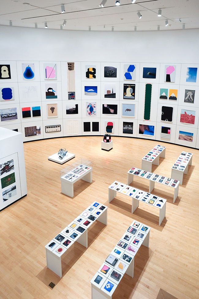
Tu exposición retrospectiva en el Burchfield Penney Art Center abarcó un amplio período de tu carrera. ¿Cómo ves la evolución de tu trabajo desde tus primeros proyectos hasta ahora?
Fue interesante hacer la exposición retrospectiva porque, aunque me considero una persona consciente de sí misma, el proceso de observar todo mi trabajo junto me ayudó a entender cómo veo las cosas, lo cual parece raro decir. Pero, en última instancia, ese es el único posible tema de una exposición retrospectiva: ¿Cómo ve el mundo el artista? Me hizo pensar que un artista es básicamente un conjunto de inclinaciones o tendencias que se desarrollan en el trabajo de diferentes maneras, una y otra vez.
¿Cómo colaboras con clientes como Warby Parker, Sonos o Continental Tires para integrar tu enfoque artístico en el diseño de productos comerciales?
Es algo que se maneja caso por caso. En el caso de Continental Tires, me buscaron porque querían usar un estilo de ilustración de coches que había desarrollado. Con Sonos, se trataba más de aplicar mi sensibilidad general al proyecto. También he sido contratado por grandes compañías para proyectos que no pasan de la fase de bocetos. Así que nunca sabes.

¿Qué desafíos enfrentaste al convertir tu proyecto sobre los carritos de la compra de un proyecto visual en un libro publicado, y cómo fue el proceso de revisión para la edición de 2023?
Había visualizado el proyecto de los carritos como un libro desde el principio, por lo que fue muy fácil adaptarlo. Conseguí el primer contrato de libro con Abrams en 2005 porque diseñé un póster plegable del sistema de carritos que hice como pieza promocional, y alguien lo llevó a un editor que luego se acercó a mí para hacer el libro. Para la edición revisada, la editorial University of Chicago Press me contactó y me preguntó si estaba interesado en hacer una nueva versión. Ya había estado pensando en ver si alguien estaría interesado en reeditar el libro, así que el momento fue perfecto. Crear la edición revisada fue un proceso muy satisfactorio. También fue una oportunidad para agregar trabajo que había hecho después de que el libro se publicara. Revisité el trabajo que había hecho 17 años antes, y, por supuesto, había aprendido algunas cosas y me había vuelto una persona más hábil en ese tiempo. Los cambios que más quería hacer eran en la tipografía y el diseño; la nueva edición es más refinada en ese sentido. También decidí que nada del original era sagrado en cuanto a qué fotos usar y dónde aparecerían en el libro. Volví a mis negativos originales y archivos digitales y, a veces, hice diferentes elecciones. En algunos casos, utilicé tomas que mostraban un poco más del paisaje. En 2006, tenía reglas conceptuales bastante estrictas para mí mismo sobre la composición de las fotos, pero, en retrospectiva, algunas de ellas ya no me parecían importantes para la obra.
¿Qué papel juegan los objetos efímeros y la memoria histórica en tu trabajo como diseñador y fotógrafo?
Hay muchas respuestas diferentes a esa pregunta. Me siento continuamente atraído por el cartel como forma. En parte porque me gusta la manera en que unas pocas palabras y una imagen pueden transformarse mutuamente, pero sobre todo por la forma en que los carteles operan más allá de su utilidad original. Los carteles (generalmente) se crean para comunicar información sobre un evento con una fecha determinada. Luego, el evento ocurre y el cartel sigue comunicando esa información indefinidamente. Para algunos, se convierte en una forma de recordar el evento; para otros, les deja saber que tal cosa sucedió; y para algunos más, el cartel es la última huella de que el evento existió alguna vez. Esto es diferente de las portadas de libros y discos, porque estas están vinculadas a contenidos específicos. Pero el cartel continúa existiendo en el futuro mientras el evento desaparece en el pasado.
¿Qué te llevó a explorar y mezclar tantos medios diferentes, como ilustración, fotografía, instalación y diseño gráfico?
Parte de la razón puede ser que no fui a la universidad ni para arte ni para diseño gráfico. De muchas maneras, desearía haberlo hecho, ya que empecé mi carrera bastante tarde. Sin embargo, al estar fuera del sistema, nunca tuve que elegir un medio o un camino específico en un contexto institucional. No hay razón para no trabajar en diferentes medios si la idea te lleva allí. Personalmente, me siento cómodo con las etiquetas de “artista” y “diseñador gráfico”, pero dudaría en llamarme pintor, artista textil o escultor, etc., porque creo que la gente ve esas etiquetas con más significado del que yo les doy.
JULIAN MONTAGUE
English:
Julian Montague is an artist, illustrator, graphic designer, and photographer based in Buffalo, New York. His work spans a wide range of media and approaches, from long-term conceptual photography projects to creating ephemeral elements for a fictional 1970s art institution, to geometric abstractions made from old clothing fabrics. Montague has exhibited widely and has works in numerous public and private collections. In 2023, a mid-career retrospective of his work was held at the Burchfield Penney Art Center in Buffalo, New York. His work has garnered attention from Dwell, Frieze, Hyperallergic, It’s Nice That, and many others. In 2021, The New York Times recommended his Instagram account as one of the best art accounts to follow.
As an artist/designer, Montague has collaborated with global clients, including Continental Tires, Maison Kitsuné, Monotype, Moncler, Sonos, and Warby Parker. Montague often works in the editorial and music industries, with a notable collaboration with the record label Jazz is Dead, founded by Adrian Younge and Ali Shaheed Muhammad, for which he designed the visual identity of the label and the packaging of more than 25 albums. Last year, the University of Chicago Press published a revised edition of his 2006 book The Stray Shopping Carts of Eastern North America: A Guide to Field Identification. The book was the result of a long-term artistic project that created an elaborate classification system for shopping carts that had strayed from their intended use.
Why are we telling you about Julian? Because these days he is landing in Spain for the Moments festival, and we want you to discover one of the great creatives of the 21st century. Don’t miss him if you’re in Madrid, Seville, or Malaga in the coming days.
How did your hometown, Buffalo, influence the development of your artistic and visual approach?
I think coming of age in a city in decline gave me a certain kind of perspective. For those that don’t know, Buffalo is on the western end of New York State, on Lake Erie just 30kms from Niagara Falls. It’s as far from New York City as Barcelona is from Madrid. Back in the 1990’s and early 2000’s the conditions in Buffalo were similar to other “rust belt” cities like Detroit and Cleveland. Decades of economic and population decline left these once wealthy Victorian cities feeling like empty ruins. There was an interest at the time among local artists in exploring the realities of the city, my project about stray shopping carts was my way of engaging in that idea. One influence came from an experimental zine called Basta!, which took as its main theme the question of what it meant to live in a disintegrating rust belt city and what those conditions might make possible. It proposed the idea that we had nothing left to lose in Buffalo, and that we could make things happen for ourselves. That felt like a defiant stance at a time when smaller cities were often treated as cultural backwaters and it was expected that most talent and energy would eventually be drained out to New York City. The idea that I could make something out of our city’s situation on our own terms was important to me. These days there is a more positive vibe, but a lot of the underlying issues still exist.
What was the motivation behind your project “The Stray Shopping Carts of Eastern North America”? What inspired you to create a classification system for abandoned shopping carts?
The idea for the project began in 1999, in Buffalo. I was driving through an intersection in a commercial area of the city For some reason I noticed that there were shopping carts on every corner of the intersection, at bus stops, in parking lots, on lawns, tipped on their sides, it struck me as strange in that moment. I realized quickly that if I just took pictures of the carts around the city is would only read as fairly conventional social documentary photography. While I didn’t necessarily disagree with the social and political implications of that kind of work I thought it would be more interesting to think about how carts were objects that moved through urban space in a unique way. Unlike other forms of litter or junk, shopping carts can be appropriated and re-appropriated moving from place to place, sometimes over the course of years. They can be used for utilitarian purposes or for more metaphysical acts like vandalism or the staging of visual jokes. This led me to think of the carts as an animal-like natural phenomenon that I could learn about via observation. I decided to categorize them based on the situations in which I found them, and on the potential they had to transition to other situations. This eventually led to a system of two main classes True Strays and False Strays, and thirty-three subcategories. The project, which I worked on from 1999 to 2007, ultimately became about the way that language and naming can change how people see. The project gives language to something familiar that has gone unarticulated. After seeing the work, people often tell me that they see shopping carts everywhere, or that they saw a shopping cart and wondered what type it was. Even if they thought the project was ridiculous, knowing that someone had named the different types of shopping cart situations was something that was hard to un-know once it was known.
How do you balance your work between commercial graphic design and your more personal conceptual art?
It is a difficult balance when it comes to how I spend my time. Especially now that I have small kids it is much harder to find the time for the experimental end of the art practice. As for the conceptual balance between the two, I think they are getting closer together. I draw a line between the two practices, but there is increasingly an overlap between the visual elements in my art and design work. When clients show me the work of mine they like, it’s often a mix of client work and artwork.
What creative processes do you follow when designing visual identities for brands and record labels like “Jazz is Dead”? How did you end up working with such a cool jazz music label?
For me identity design is a lot of trial and error. For me there is a lot of sketching to try to find some workable directions. And then there is the back and forth with the client to get to the right solution. The Jazz is Dead identity involved a lot of back and forth with Adrian Young who co-founded the label with Ali Shaheed Muhammad (Tribe Called Quest). When you are working with other artists on something it brings in another level of dialogue since the have a really nuanced sense of how they want their project to feel. I ended up working with them because Adrian reached out to me on Instagram and said he liked my work, I said let me know if you want to work together and shortly after that I started on Jazz is Dead. I think he asked me to do it because we are both interested in engaging in the past (particularly the 1970’s) in a similar way.
What led you to create the fictional 1970s art institution as part of your conceptual work?
I had started making fake books back in 2010 as part of multifaceted art project about the intersection of animals and architecture, mostly regarding spiders and insects. Part of the framing of the project was that was that there was an unknown author at the center. I realized that as part of my exhibitions I could include this author’s “reading material” in the form of old books mocked up with covers I created. The books all dealt with the animals and architecture and appeared to be from the midcentury era. This allowed me to put ideas in a direct way into the viewers minds with in sort of authoritative way. Some people thought the books were real, but even if you knew they were fake you kind of had to imagine what the book was about. I made fictional records, book covers and posters for this project for a few years, those included some posters for a fictional mid-century art institution called the Thorold Gallery. At some point gallery took on a life of its own and I started only making material for the Thorold. I liked the idea that the exhibition poster was a prompt for the viewer to imagine the exhibition into being. In a way fake posters are not so different from real exhibition posters that advertise a show you will never see. The gallery turned out to be a great conceptual framework for my practice because it generated so many ideas which led me to work with all kinds of mediums to create the artwork for my fictional artists. And the cool part a fictional art institution, is that I keep discovering new aspects of it. It was originally imagined to be a pretty modest place, now it has a sculpture garden, screening rooms, library, etc.
In your project “Domestic Materials,” how do you use household materials to create geometric abstractions, and what message are you trying to convey through this work? Tell us about this new project, which, if I’m not mistaken, is visiting Europe for the first time.
I have not shown this work in Europe before. The visual language of these pieces developed over the last few years in my paintings. Weirdly, I originally only started making paintings because I was creating material for the artists I invented for my fictional exhibition posters. So I kind of ironically fell into having a formalist art practice. I had worked with used fabric on past projects, mostly to make large pieces for the least amount of money. With these pieces there is some of that feeling, I enjoy taking these mundane materials, often my old clothes and giving them a new, non-utilitarian, purpose. It’s not message-oriented work in that I don’t intend for the choice of materials to make a statement on fast fashion or overconsumption, at least not directly. As far as the experience of the art goes I’m more interested in the way that these familiar textures affect the tone of the pieces. Most of the compositions are abstract, but tend to resemble structures of some kind, I’ve realized recently that I think I’m subconsciously referencing all the strange abandoned industrial towers and buildings in Buffalo. There are a few representational pieces mixed in as well, I’m trying to figure out how their presence changes the other pieces.
Please tell us about the workshop you are gonna do in sevilla, malaga and madrid
The workshop, “Designing in Reverse” is a set of exercises and experiments that were inspired by the way that I make my fictional posters and book covers. Unlike proper client-based design where you receive the title information and then formulate a cover concept and design, with my fictions I often have a graphic in mind and then try to think of a title to fit it. I find that the process of creative thinking that this involves is a great way to develop a generative sketching practice.
What you like more about spain, also about design in spain?
I love Spain. My personal history that goes way back. My mother was a high school Spanish teacher who arranged a lot of student exchanges, although I didn’t go to the school where she worked, she was able to arrange for me to go to Spain as an exchange student. I spent six weeks staying with a family in Asturias in the summer of 1990 when I was 16, and then 5 months with a different family in Javea and Madrid in Summer/Fall of 1991. I know a surprisingly high number of Mecano and Duncan Dhu songs. Somehow I didn’t return to Spain until 2013, but this will be my fourth visit in 10 years. I’ve been working on reviving the intermediate level Spanish that is still in my brain.
My impression is that Spain is a great place for graphic design. I follow a number of Iberian designers and studios on Instagram, some of them I’ve met IRL as well. A few that come to mind are Hey Studio, pfp, disseny, Estudio Husmee, TGA, Studio Quim Marin, Unbuentipo, and others I’m probably forgetting.
Your Instagram account has been highlighted as one of the best art accounts by The New York Times. How do you manage digital content and social media to promote your work?
My success on Instagram over the last 10 years has been really surprising. I never thought I would be able to get this big a following (180k) with the kind of content I make. I really only have one basic guiding idea for my account and that is that I think of it as a space that I curate for an audience. While I do promote my work on the account, for every one post of my work there are around five posts that feature a piece of design or art that I think is interesting. I want the account to feel like it is giving the viewer something as opposed to just asking for attention. This strategy makes it easier to come up with content and it allows me to contextualize my work with the things that inspire me.
Back in 2009 I started a blog project where I posted a book cover every day for a year and then I continued to do that for two more years. So by the time Instagram happened I had this big collection of book cover images. Those years of digging for books refined my taste and introduced me to a lot of mid-century graphic designers who were, in my opinion, under-recognized. That’s partly why I focus my curated content on graphic design from 1955 to 1980, it deserves to be appreciated by more people.
How does the “do-it-yourself” (DIY) aesthetic of subcultures like punk, graffiti, or skateboarding influence your graphic design style?
I was completely obsessed with skateboarding when I was in middle and high school. I bought my first issue of Thrasher in 1986 and Transworld not long after that. Skateboarding was popular in that era but on a much more subcultural level than today. Buffalo, NY was very far away from California where the skateboarding world was based, the magazines were the only source of cultural transmission, I would study every image and ad in those magazines. I think the graphics from that era had a huge effect on my interest in graphic design. On the photography side I consider the photographs of J. Grant Brittain to be foundational to my sense of aesthetics. The fact that both J. Grant Brittain and Natas Kaupas follow me on Instgram would have made the 14-year-old me very happy. It was also cool to realize later on that David Carson had been the art director of Transworld in those years, and that those layouts were something being talked about in the design world at the time. There was an irony in the fact that at the time that Transworld was too slick and commercial compared to Thrasher which was printed on newsprint, when in fact it was Transworld that was breaking all the rules of graphic design.
Your retrospective exhibition at the Burchfield Penney Art Center covered a broad period of your career. How do you view the evolution of your work from your early projects until now?
It was interesting to do the retrospective exhibition because even though I think of myself as a self-aware person the process of standing back and looking at it all together helped me understand how I see things, which seems odd to say. But ultimately that is the only possible theme of a retrospective exhibition; How does the artist see world? It made me think that an artist is basically a set of inclinations, or tendencies that they play out in the work in different ways over and over.
How do you collaborate with clients like Warby Parker, Sonos, or Continental Tires to integrate your artistic approach into commercial product design?
It is on a case by case basis. In the case of Continental tires, they came to me because I had a style of illustrating cars that they wanted to use. With Sonos it was more about applying my general sensibility to the project. I’ve also been brought in by big companies for projects and it doesn’t make it past the sketching phase. So you never know.
What challenges did you face in turning your project on shopping carts from a visual project into a published book, and what was the revision process like for the 2023 edition?
I had envisioned the shopping cart project as a book from the beginning, so it was very easy to adapt it. I got the first book deal with Abrams in 2005 because I had designed a folding poster of the shopping cart system that I made as a promotional piece and someone took it to an editor who then approached me to do the book. For the revised edition the University of Chicago press reached out to me and asked if I was interested in doing a new version. I’d been thinking about seeing if anyone was interested in the book so the timing was perfect. Creating the revised edition was a really satisfying process. It was also an opportunity to add work that I had made after the book went to press. I was revisiting work I had done 17 years before so of course I had learned some things and become better a more skilled person in that. The changes I was most eager to make were to the type and the layout, the new edition is more refined in that way. I also decided that nothing was sacred from the original as far as which photos I used and where they appeared in the book. I went back to my original negatives and digital files and sometimes made different choices. Where I used shots that showed a bit more of the landscape. In 2006 I had some fairly rigorous conceptual rules for myself for the composition of the photos, but in retrospect some of them didn’t seem important to the work anymore.
What role do ephemeral objects and historical memory play in your work as a designer and photographer?
There are many different answers to that question. I’m continually drawn to the poster as a form. In part because I like the way that a few words and an image can change each other, but it is mostly because of the way that posters operate beyond their original utility. Posters are (usually) made to communicate or the information about a time sensitive event. Then that event happens and the poster goes on communicating that information indefinitely. It becomes a way to remember the event for some, to others it lets them know that such a thing took place, and then for others the poster is the last trace of the event ever existing in the first place. This is different from book and record covers because they are advertising specific contents to which they are attached. But the poster just continues on into the future as the event disappears into the past.
What led you to explore and mix so many different media, such as illustration, photography, installation, and graphic design?
Part of the reason may be that I did not go to university for either art or graphic design. In many ways I wish I had gone to school as I ended up getting a late start on my career. However, being outside of the system I never had to choose a medium or a specific path in an institutional context. There’s no reason not to work in different mediums in an idea leads you there. I’m personally comfortable with the label “artist” and “graphic designer” but I would hesitate to call myself a painter, or a fiber artist, or a sculptor, etc. because I think people invest those labels with more meaning than I do.